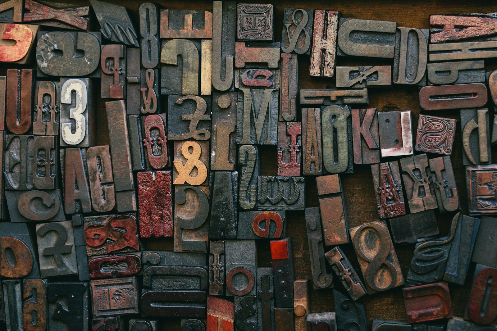
Typography is a fundamental element in both graphic and website design. It plays a crucial role in conveying your message, setting the tone, and enhancing the overall user experience. When used effectively, typography can significantly impact the readability and aesthetics of your design. Here’s how to use typography in graphic and website design to create visually appealing and engaging content.
Understanding the Basics of Typography
Before diving into the specifics of using typography in design, it’s essential to understand the basic principles:
- Font vs. Typeface: A typeface refers to the design of the characters, while a font is a specific size and weight of that typeface. For example, Arial is a typeface, while Arial Bold 12pt is a font.
- Hierarchy: Creating a clear hierarchy helps guide the reader’s eye through the content. This can be achieved using different font sizes, weights, and styles.
- Legibility and Readability: Legibility refers to how easily individual characters can be distinguished, while readability is about how easily text can be read in context. Both are crucial for effective typography.
Choosing the Right Typeface
Selecting the right typeface sets the foundation for your design. Here’s how to choose a typeface that enhances your design:
- Match the Mood and Tone:
- Different typefaces evoke different emotions. For example, serif typefaces like Times New Roman convey a sense of tradition and reliability, while sans-serif typefaces like Helvetica are seen as modern and clean.
- Consider Your Audience:
- Think about who will be reading your content. A playful, decorative typeface might be appropriate for a children’s website but not for a corporate report.
- Ensure Versatility:
- Choose a typeface that offers various weights and styles. This allows you to create a consistent look while maintaining flexibility in your design.
Establishing a Typographic Hierarchy
A clear typographic hierarchy helps readers navigate your content effortlessly. Here’s how to establish it effectively:
- Use Different Font Sizes:
- Larger fonts naturally draw more attention. Use larger sizes for headings and subheadings, and smaller sizes for body text.
- Play with Weights and Styles:
- Bold, italic, and regular weights can help differentiate different levels of information. For example, use bold for headings and regular for body text.
- Utilize Color and Contrast:
- Color can emphasize important information and create visual interest. Ensure there’s enough contrast between text and background for readability.
Combining Typefaces
Using multiple typefaces can add variety and interest to your design, but it’s important to do so thoughtfully:
- Limit the Number of Typefaces:
- Stick to two or three typefaces to avoid a cluttered look. A common approach is to pair a serif and a sans-serif typeface.
- Ensure Compatibility:
- Choose typefaces that complement each other. They should share similar proportions and feel cohesive when used together.
- Use Contrast Wisely:
- Contrast between typefaces can help establish hierarchy. For example, use a bold serif for headings and a light sans-serif for body text.
Enhancing Readability
Ensuring your text is easy to read is essential for effective communication:
- Optimal Line Length:
- Keep line lengths between 50-75 characters. Too long or too short lines can strain the reader’s eyes.
- Adequate Line Spacing:
- Use appropriate line spacing (leading) to make your text more readable. Typically, line spacing should be 1.25 to 1.5 times the font size.
- Proper Alignment:
- Align text consistently. Left alignment is generally best for readability, but centered text can work well for titles and short blocks of text.
Using Typography in Web Design
When applying typography to web design, consider these additional factors:
- Responsive Design:
- Ensure your typography adapts to different screen sizes. Use relative units (like em or rem) instead of fixed units (like px) for font sizes.
- Web-Safe Fonts:
- Choose fonts that are available on most devices or use web fonts from services like Google Fonts to ensure consistency across different platforms.
- Performance Considerations:
- Limit the number of web fonts to avoid slowing down your site. Optimize font loading to improve site performance.
Conclusion
Using typography effectively in graphic and website design can elevate your brand and improve user engagement. By choosing the right typefaces, establishing a clear hierarchy, combining typefaces thoughtfully, and enhancing readability, you can create designs that are both visually appealing and functional. Remember to consider the specific needs of web design, such as responsive typography and web-safe fonts, to ensure a seamless user experience across all devices. Implement these strategies to harness the power of typography and make a lasting impact with your designs.